Thursday, October 31, 2013

Happy Halloween!!!

WOO HOO!!!  IT'S HALLOWEEN!!!

I have the last mini I made to show you today.

I got the tutorial here, by myserenitycrafts, on YouTube. It is a cute little mini album made from file folders, with lots of pages and tags that I think you'll like.  After reading this post, pop on over to her channel and watch the video.  It is a super cute and super easy project!

 I used papers by Carta Bella and My Minds Eye.  I also used rubons (the spider web) by Creative Imaginations.
 The skull bead and the Crow (From Bead Landing) are attached by a piece of jute that I threaded around the center of the project.
 There are a ton of pages, half-tag pages, and pockets filled with even more tags.
 I used some stickers from the collections and backed them with extra pieces of the file folder to make more tag.  I distressed everything with Tim Holtz Distress ink.
 Isn't this adorable??!!
 Some of the pages are plain, no pockets, perfect for full pictures.
 More pages.
 I love these rubons!
 More tags using the stickers.
 The right page has a sticker that I adhered to a piece of file folder, then adhered to the page on two sides, creating a pocket. I did this to a couple of the pages.
 I love this paper!
 The back o the book.
There are three top pockets, where these tags live.  I used my Epiphany Round Embellishment maker to create the tab pulls.

This project is perfect for 6x6 paper pads that I have and don't know what to do with!!  Do you have these pads also??

I hope you enjoyed this project.  I hope you have a hauntingly awesome Halloween.

Stay Scary, My Friends!

Tuesday, October 29, 2013

Halloween Mini Album

Hello, everyone!  I made a quick mini album that I wanted to share, with a mini tutorial to go along with it.  It is based off of my "Never Ending Mini Album" but I used bigger papers and created pockets as well. Click on that link for the tutorial of the little mini with the basic design of the album, and the other variations that I have done with it!  This is one more variation.  Don't you love that you can take all of these album designs and redo them into something totally different?

This album measures 8" high, and 7 1/2" wide.  I used some papers I found from Office Depot that are 11"x17".  The brand is "Neenah Creative Collection".  It is 32lb paper so it is heavier duty, not quite cardstock but better than standard paper, and it comes in black, kraft, and white.
I scored the first piece on the left at 1", then at 8 1/2", then I cut off 1" on the right side.  I saved that piece to make the two hinges you see right by my fingers.  I scored the bottom at 3" for the pocket.  I made the hinges by cutting the 1" scrap into two pieces at 3" and beveling the edges.  I adhered them one to each side of the bottom score line.  When you put the fold up and adhere the bottom tabs, taa daa, pockets.  The right side is adhered only by one strip of 1/4" score tape on the 3" side.  This cut edge is going to be bound into the binding of this book, so that's why we don't need a hinge here.  The 1" side on the page is just adhered down to help create stability to the page since this isn't cardstock.  If it was cardstock, I wouldn't have done it.  The left side is the side you will be touching to turn the pages.  ADHERE THE RIGHT SIDE 1" FLAP DOWN FIRST BEFORE FOLDING UP AND ADHERING THE POCKETS!!
I scored and cut the second  piece exactly the opposite of the above piece.  (Please ignore the length of the hinges.  I goofed!)
The third piece is scored at 1", 8", 8 1/2", 9" and 16".  Then at 3" on the bottom.  Cut as shown.   The pockets will be formed with the 1" tabs on the side and the 1/2" tabs in the middle.  

When everything is scored, cut folded and adhered, take the two cut edges of the pages and stand them up.  Put two strips of score tape on the inside of the 1/2" scores on the third piece, and adhere them down.  You do NOT want to adhere anything between the first two pieces.  Just adhere the cut edge into the 1/2" score.  Line up the pockets as shown. 
 Top view.  Sorry the picture is a little dark, but this will give you the visual also.  The two strips of the Scoretape in the 1/2" score space is the binding.
 This is the cover.
 Opened to see the pockets...I added tags made from the scraps left over.  Since the base paper isn't card stock, I put full pieces of patterned paper into the pockets to add some stability.  The folded 1" edge also helped with stability of the edges.
 Then the album opens again to the right.  You will have 4 pages with no pockets.
 This is the back of the book.
 It opens to see pockets...
 And opens again for another full page.
 This is the middle of the book.  I created pockets for this page with the papers, otherwise this would be a full page.
 Heres a "front view" of the book.
Here is a top view.  The left side in the back  is the inside front cover, the right side in the back is the inside of the back cover.  The two pieces in the front are the third piece we scored, the binding of the book.  The "V" in the center opens to reveal the black and white harlequin paper in the middle of the book.

I used My Minds Eye papers for most of the book, with one page of Recollections.  This book is not good for a lot of embellishments, so decorations with paper, stickers and tags is a must since it folds pretty flat.

I hope you liked this book! Let me know if you have any questions.  

Stay Scary, My Friends!

Saturday, October 26, 2013

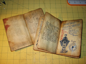
Vampire Journal

I was surfing around on YouTube when I came across this video by The Paper Addiction.  She had a link from where she got the printouts for the project from How to Haunt Your House.  They are journals, as someone might have written while on the great Vampire hunt. One has pictures of Vampires being hunted and records of when they were "killed". When I saw it I just HAD TO MAKE IT!  It is a very cool prop for your Halloween decorations.  Here is my version of it.

 The covers are by 7 Gypsies, with some faux leather and suede paper that I got from JoAnn's for the binding.
 The site provides all of these printouts.  All you have to do is cut them out and paste them together.  I distressed the pages with Tim Holtz distress ink and also crumpled the pages to make them look worn and used.
They also had some maps that were part of this download.  I printed them on parchment paper to give the backs some more authenticity.  Then I distressed, rumpled and folded them.  One each lives within the pages of each book.
And this is how I displayed them on my table with the box "book" that I got from JoAnn's this year.  These will live in this book for storage.  Or maybe I'll just keep them out all year.  I just don't know!

Stay Scary, my friends!

Saturday, October 19, 2013

"Tonic" Halloween Album in a Box

 I wanted to share with you an album I made with the kit I purchased from "The Hen's Den." This is a link to their website, but I found this beauty at their booth at the CK convention last year.  I fell in love with it!  (Jeez, I wonder why?  HAHA!)  This is one of the coolest album kits I have ever seen.
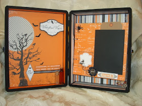
 It's all enclosed with a box that you paint and cover with papers.  I added a few of my own stash pieces to it as well, and altered the pages a little bit for my own needs.  But, here it is.  It uses papers from Echo Park's Apothecary Emporium Halloween line.  I LOVE IT!
 The album is attached with a Tim Holtz binding ring piece.
 The inside cover.
 The pages were a little big, I had to cut them down a wee bit, but every box may be a little different, and so it goes.  I also decided to create pockets behind the mats and some of the page elements so that I could have more space for journaling and pictures.
 The pages are constructed as the kit instructed them to be done, except for my pockets.
 LOVE THIS!
 Behind the large panel is open for a pocket.

 I added some embellishments from 7 Gypsies, flowers (Petaloo, Bazzill, Recollections), bling (Recollections, Prima), brads from MME, spiders and glass dome sticker by Jolees, Stickles by Ranger, and distress ink by Tim Holtz.

 There is LOTS of room for pictures and journaling, and plenty of space in the box to house it all.


 This is the back page.
I love this glass dome sticker.  I also added the skull bead from my stash.

I hope you like it!  I loved putting this together.  Hop on over to "The Hen's Den" and check it out...and if you go to a CK Convention, check out their booth.  Amazing!

Stay Scary, my friends!!!

Tuesday, October 15, 2013

More Arc Planner Stuff for You

Hi all.  I wanted to show you my version of an Arc Steno Notebook.

THIS IS NOT MY IDEA.  I got it from here...And Now It's All This.  But, man-oh-man, what a cool idea.

 Sorry for the picture, it is a little bright, but you get the idea.  I created a steno book in Arc fashion and I LOVE IT!  The only problem for me is that I couldn't punch chipboard like I wanted to, and I wanted tabs.  What to do?!  So, I had some full sized 8 1/2" by 11" poly-dividers for my big Arc notebook that I haven't taken out of the package yet.  They were only $4!  They would work!
I printed off this page from the above site, cut them, punched them, and refashioned my dividers to suit my needs.  The back of the steno book is a divider with the tab cut off, so that I have three complete sections. DONE!  An Arc Steno Notebook!!!  I think this will be good for my project planning, doodling and sketching.  It will also fit in my project notebook when I am done (sideways but who cares?).  I think it will live on my bed stand, for those times when the ideas strike and I need to jot it down quick!

Then, I was wondering what to do with some scraps of paper I had, some really good quality paper that I just couldn't bear to get rid of.

 I made these note page dividers!  The tab does come out over the page so that I can write on it.  I have a stash of these DIY beauties now, YAY ME!
I did have to bend them a little to get them into the punch without punching a hole in the tab part, but it worked great!

What's in your planner?

Stay crafty, and organized, my friends!